
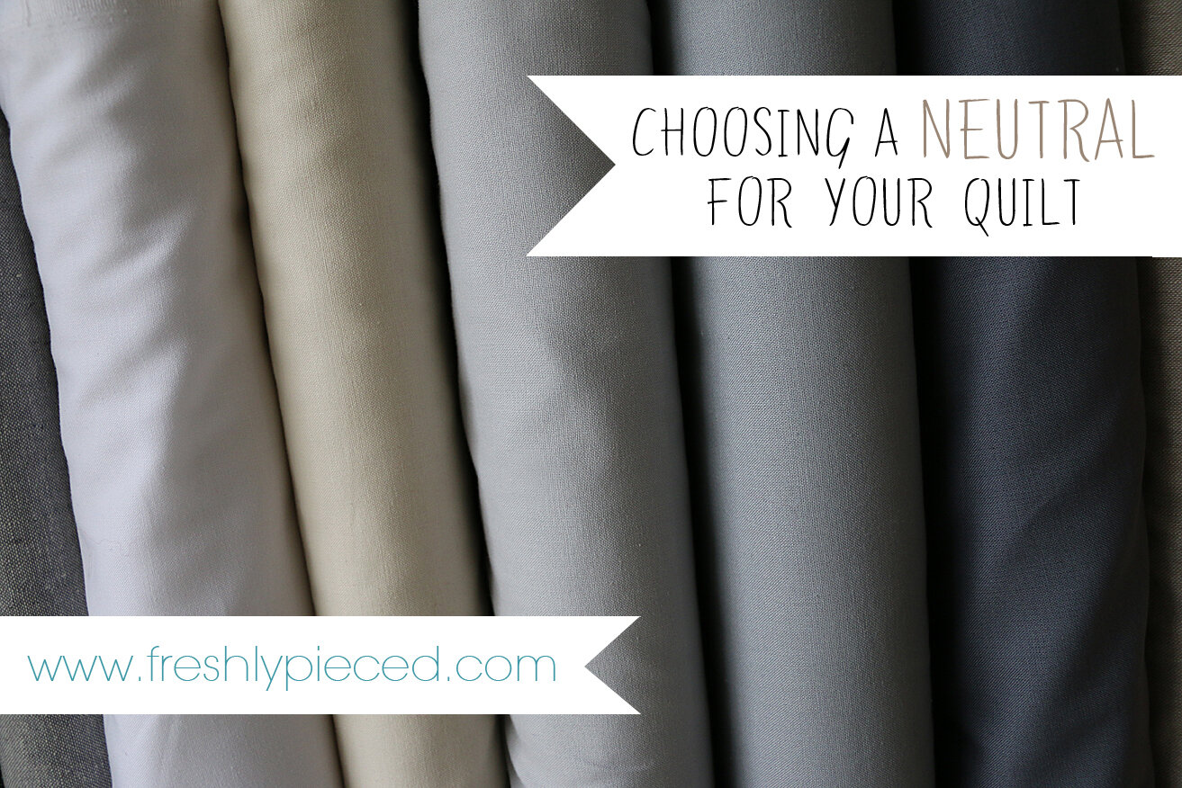
Choosing a Neutral for Your Quilt, Part 2: My Kona Cheat Sheet
Yesterday we talked about questions you can ask yourself in order to identify a great neutral for your next quilt. So now that you've narrowed down the options as far as value and warm/cool, how do you choose from the eleventy thousand solid shades now on the market?
It's daunting, isn't it? I love love love the variety of solids we have now—there are probably twice as many choices now as when I started quilting seven years ago. But sometimes that dazzling variety can also get overwhelming. Grays are particularly challenging, since grays can have any color cast in the spectrum, and different grays don't always go together. So let's break it down, shall we?
My go-to solids brand is Kona Cotton by Robert Kaufman, and I know that's what many of you go for as well. It also happens to be the line with the most colors by far—303 shades, as of a few months ago! So to make the selections a little easier for you, I've put together a Kona Cotton Neutrals Cheat Sheet. You can download a FREE PDF of the Cheat Sheet by clicking here. Print it out and keep it with your color card, or just open the PDF on your phone or your tablet while you're shopping.

My Kona Neutrals Cheat Sheet does the legwork on Kona Neutrals for you. For each color category—Grays, Browns, and Whites—I've determined whether particular shades qualify as "Warmer" or "Cooler." From there, I've also selected a few shades in each color group that I believe to be your "Most Neutral Choices." While the "Most Neutral Choices" shades are also categorized as either warmer or cooler, these are the ones I think fall closest to the middle of that spectrum.
A few things to note:
First, my Warmer and Cooler designations are all relative. For example, brown skews warm most of the time. So even the "cooler" browns on my Cheat Sheet are still a bit on the warm side—but relative to all the other browns on the Kona color card, these are the coolest.
Second: Remember how I said in the last post that color is subjective? That goes double for this post! My warm and cool designations are just the opinions of little old me. I think I've got a pretty good eye for these things, but still, you should take my categorizing with a grain of salt. Lighting and other nearby colors can change how a particular shade looks. So please use my Cheat Sheet simply as a starting point—there's no substitute for seeing and comparing the colors in person, if possible!
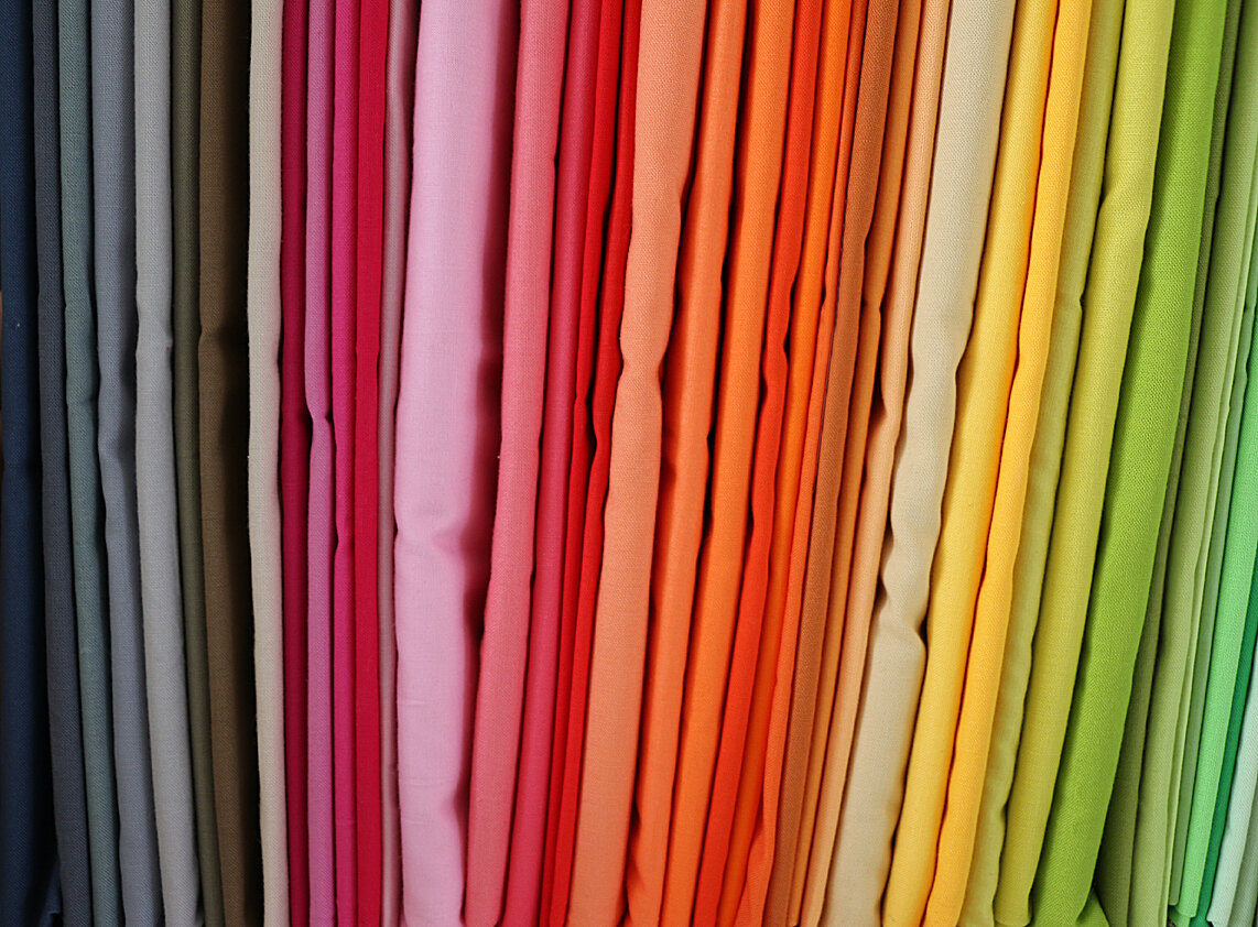
Finally, let's talk briefly about the "Color Neutrals" category. Under this category, I've listed some of the Kona colors that I think work really well as neutrals, along with the general color family of each. This is by no means a complete list—it's just some of my past and present favorites. There are so many others you could try. Really, any color that isn't bright or saturated could work as a "color neutral"—explore the possibilities!
My favorite quilt in which I used a color neutral is this one, made from the Sherbet Pips line by Aneela Hoey:
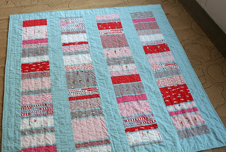
The prints I used here are very heavy on the warm colors, all red and pink. So Kona Ice Frappe for the background was a great choice, because it cooled off the temperature of the quilt significantly.
In fact, here's a handy tip for using color neutrals that comes straight from my experience with my Sherbet Pips quilt: If you're using one fabric line (as I was in this quilt), consider pulling your background color straight from that line's color palette. In this case, I simply left out all the Sherbet Pips prints in blue, then chose a soft blue background that matched the blue prints I didn't use. No muss, no fuss!
I hope this "Choosing a Neutral" series has been helpful to you, and that the Kona Neutrals Cheat Sheet comes in handy as well! Now go find the perfect neutral for that gorgeous pile of fabric you pulled the other day. Happy sewing!