
A scrappy take on my Picnic Plaid pattern

Color gradients. Remember when I said I wasn't going to go there anymore?
Yeah, I went there. Again. I couldn't help it, you guys! Gradients: So colorful. So orderly. So appealing to both the left and right sides of my brain. 😂

So this is my latest addition to my always expanding collection of color-gradient quilts. 😊 This is a scrappy version of my Picnic Plaid quilt.
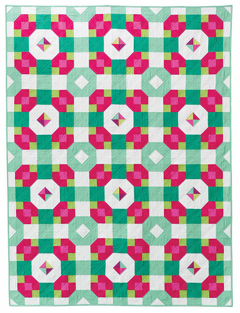
Here's a shot of the original Picnic Plaid quilt. The original was strip-pieced in a narrower color palette, but I've had the urge to make it scrappier for some time now.

Stephanie Palmer worked her usual quilting magic on it. I've always loved loopy quilting, and now I finally have a quilt that makes use of it!

This quilt has what might be my favorite print ever for a quilt back: Zen Chic's "Notes" print in Charcoal on Fog. The binding is an older Zen Chic print called Barcelona. You can see a chunk of that print in the piecing above as well. I was really feeling the Zen Chic that day, I guess!

Regardless of which version of Picnic Plaid you prefer, it's yet another great demonstration of how much print and color can change the look of any given design. Fun!