Choosing a Neutral For Your Quilt: Part 1
One question I've heard from blog readers and other quilters over and over is, "How do you choose a neutral?" Since my quilts almost always have a neutral solid background, I've been meaning to write a blog post (or two) on this subject for ages, and I finally got my act together and did it. Here's the thing though: I wish I could give you an easy answer to this question, but sadly, I can't. It's not an exact science, by any means. Color is subjective, it's affected by other colors around it, and it's always and forever a matter of personal opinion. It's not an "If X, then choose Y" situation, is what I'm saying.
Still, there are some questions you can ask yourself to help select a neutral for your next quilt. Read on!
1. Dark or light? I think the first thing to consider is whether you want a neutral that is dark, light, or somewhere in between. To determine this, ask yourself whether you want a high-contrast look, or something that blends a bit more? Do you want this quilt to be bold and graphic, with a "kapow" quality to it, or do you want it to have a softer, more subtle effect?
Once you've answered those questions, take a look at the other colors or prints you're using in the quilt. If you're using a lot of light, bright prints, and you're going for a high-contrast look, maybe a dark gray will set off your prints most effectively. Conversely, if the other colors in your quilt are bold and higher-value, a white might be the way to go.
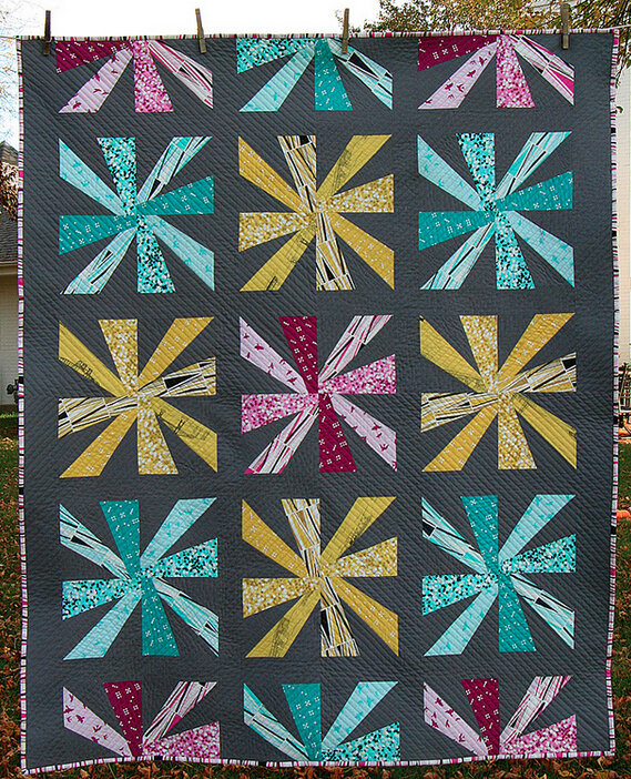
For example, take this Cartwheels quilt that I made last year:
You'll notice that the prints I used have a fair amount of white in them. And while a few of the prints are on the darker side, overall they tend toward the lighter end of the spectrum. I usually love for my quilts to be high-contrast and very graphic, so I decided a darker neutral was the way to go, to really contrast with those lighter prints.
But what if I had gone with something lighter? Could that have been a good choice as well? Thanks to the magic of Photoshop, we can see what this quilt would have looked like with a lighter gray background:
Hmm. It doesn't have the impact of the original, does it? It's not horrible or anything—in fact, the softer look might be perfect for a baby quilt (and is very similar to the color scheme of my original Cartwheels quilt, which was, in fact, made for a baby). But there's no denying that this doesn't have the same punch as the original, and I do love me some punchy quilts. That punch comes from the contrast.
(By the way, if you're having trouble seeing the value in fabric you've selected, try taking a picture and turning it grayscale to help make the values more apparent. I find the easiest and quickest way to take and view a grayscale photo is to use my phone and turn the photo black-and-white with Instagram's Willow filter!)
2. Warm or cool? Now that you've narrowed down the light-or-dark question, the next factor to look at is whether you want a neutral that is warm or cool. Take a look at the rest of your color palette for the quilt: Is it primarily warm, primarily cool, or a relatively even mix of both? And do you want the neutral to counteract and balance out the warmth or coolness in your color palette, or should the neutral emphasize it and bring that aspect of the design out even further?Let's go back to that Cartwheels quilt from the first example:
I used primarily cool-colored prints in this quilt. Even the yellows are a bit on the cool side for yellow—they have a slight greenish cast. I wanted to emphasize that coolness with a cool neutral, so I chose Kona Graphite.
But let's Photoshop it up again, this time with a warmer neutral (the color shown is probably in the vicinity of Kona Smoke):
Wow! The background color is not all that different, but the overall effect is startling, isn't it? It's amazing how a simple warm/cool shift can bring about such dramatic changes.
Again, there's really no right or wrong answer here. It's all just personal preference and what kind of look you're going for. I happen to vastly prefer the original—the warmer neutral muddies the whole thing for me. But that might be exactly what you like about it, and that's perfectly fine. And with some print/color combinations, balancing the coolness or the warmth might be just what the doctor ordered.
Regardless of your color preferences, it's just good to make an informed decision, isn't it? And that's the goal of this post, to help you be more informed about your neutral selections. : )
So now that you have a framework for choosing a neutral, exactly which neutrals will fit the bill? Tomorrow I'll be posting the second half of my Choosing a Neutral series, with my handy-dandy Kona Cotton Neutrals Cheat Sheet! (Click here to read Part 2.) The Cheat Sheet will help you identify which Kona solid neutrals are cooler, which are warmer, and which are more middle-of-the-road. See you then!


