QuiltCon: My thoughts
By now, you've probably seen at least a dozen posts about QuiltCon (I know I have), so today my challenge is to attempt to add something new to the conversation! QuiltCon was amazing and thoroughly inspiring. But it was also a bit overwhelming and a lot of work for me, since I taught three classes. That means I didn't get to see or do everything I might have liked, and I certainly didn't take as many pictures as I should have! But I'll do my best to sum up my thoughts on the full experience.
Flame by Rebecca Bryan of Bryan House Quilts
There was a lot of discussion before the show (especially around the time people found out whether their quilts were juried in) of what type of quilts would be in the show. Now that we've seen them all, I personally think the full spectrum of modern quilting was well-represented at QuiltCon. In my own opinion, design is the single most important element of a modern quilt, and it seemed clear that the show organizers held that opinion as well. That's not to say quilting and technical skill aren't important, because of course they are, and the best quilts had all those things going for them. But there was no question in my mind that the quilts that were shown at QuiltCon were all examples of design at its very best, and as a graphic design nerd, I'm all about that.
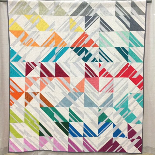
Geometric Rainbow by Nicole Daksiewicz of Modern Handcraft
If there was any one over-arching design lesson that we can take away from QuiltCon, I think it's this: Get creative with your layouts! If you aspire to make quilts that push the envelope and/or are worthy of a modern quilting show (not everyone does, and that's completely fine, but if you do), don't keep doing the same four-blocks-across-and-five-down layouts that we've seen over and over again since, oh, the 1800s. Easy for me to say, right? Since I taught a workshop on creating alternate layouts at the show. 😂 But walking around the floor, it was pretty hard to miss the layout creativity that was on display. There is so much more you can do with the blank canvas of a quilt top.
Diamond Dust by Doris Brunnette of Made By a Brunnette
Maybe that's particularly important in my own little niche of modern quilting, Modern Traditionalism. I think the QuiltCon Modern Traditionalism category was trying to tell us that it's great to use traditional blocks in a modern quilt, but if you're going to go that route, you need to offset those traditional designs by getting really creative with the layout. I personally submitted 6 quilts for QuiltCon, and had 4 accepted into the show. The 4 that were accepted had alternate layouts, which used negative space and/or block structure in unexpected ways. The two that weren't accepted? Standard tiled layouts. And I don't think I'm the only Modern Traditionalist who had that same experience. And you know what? I think that's awesome. Because: Design, you guys. 😂
What's the Point by Susan Slusser Clay
That's not to say that every quilt I make from here on out is going to have an alternate layout. The truth is that I enjoy quilts with traditional layouts just as much as the ones with more unique layouts. My Spin It Again quilt from my book Vintage Quilt Revival was rejected from QuiltCon. It's still one of my favorite quilts I've ever made, and I'm sure I'll want to make more like it in the months ahead. But a show like QuiltCon is supposed to inspire us, get our creative juices flowing, and move us in new directions. That's exactly what the show did for me, and hopefully many others. There were plenty of new directions hanging up in that convention center, and I can hardly wait to see what we all come up with next, thanks to this show!
Balancing Act by Amanda Hohnstreiter
In general, QuiltCon 2015 really was a whirlwind—with my teaching schedule, I barely had time to get through the entire show floor. I had literally NO time for shopping and came home without buying a single solitary thing. And at times the show felt a bit too overwhelming and chaotic. The quilts were displayed in pod-like groupings, instead of in rows, and I really wish it would have been set up in rows, so I could have gone through it more methodically. All the beautiful colors and designs are distracting enough as you're walking through—I tried several times to get through the whole show and hit areas I had previously missed, but somehow there were still whole sections of the show that I never saw (including the Gee's Bend quilts).
Lovely Fishbourne by Mandy Leins of Mandalei Quilts (I liked Mandy's "Egg and Dart" quilt that was in the show even more than this one, but my picture of it is terrible, sorry!)
So I'm going to wrap up this post with photos of a few more personal favorites from the show. I really wish I would have gotten better photos, but .... yeah, whirlwind again. 😂 Enjoy, and if you're thinking about attending Pasadena in 2016, well, book your hotel right now. If not sooner. LOL.
Modern Lily Bean by Claire Jain of Sewing Over Pins (I love how this one looks like Pyrex!)
Iceberg by Crystal McGann of Raspberry Spool
Percolate by Emily Cier of Carolina Patchworks
Upstairs by Kristen Lejnieks


